
Trakr. Interval tracking and planning made easy.
Trakr was a Designlab class project concept born out of a previously identified problem. For awhile, I was struggling to find an app that would let me plan intervals in my workouts. I decided to use this opportunity to dig deeper, to see if my problem was an issue for many, and if so, what would be the best solution.
The result was Trakr, a theoretical app that helps people plan and track time for various activities. The app is meant to be easy to use, yet also comprehensive and customizable.
How it Began
Trakr started from me struggling to find an app to plan and track my intervals during workouts. I soon realized this was a hole in the planning and tracking market. There were apps to plan out projects, time track like a stopwatch, or fully planned workouts with intervals built in. However, there was nothing that allowed you to fully customize your own timer with intervals to plan your own workouts ahead of time.
Is This a Problem for Many?
This lack of an app that gave you detailed autonomy of your working planning seemed unusual. It made me wonder if maybe there wasn’t much demand, or if the concept was difficult to implement in an app. So my first priority was to identify if the current time tracking apps out there are lacking functionality that many people want. I broadened my research beyond thinking about intervals and workouts, to ensure I wasn’t priming to a specific solution based on my own personal struggle.
First, I conducted a series of user discovery interviews to understand how people plan and track their time.
What did people tracked their time with? Not everyone uses an app, and sometimes old school solutions have advantages. What did they track? Was job work, personal projects, cooking, activities, workouts? What worked best for them, and where they felt current tracking and planning tools were lacking?
I kept questions broad, with the option for many different follow up questions, and let interviewees guide the discussion. This gave me a wider variety of answers and deeper insights.
Key Takeaways
Flexibility for Many Scenarios
What participants tracked and how they tracked varied. Tasks tracked ranged from workouts, to timing when to take medication, to breaking out work tasks. Most people planned out tracking before a task, a few tracked in the moment, and some did both.
Sync and Share
Desire to sync to a calendar and share with friends and family.
Some participants also mentioned wanting to plan a tracked activity with others, and share that plan with the group.
Track Multiple Tasks
Most participants planned out and tracked multiple tasks, some with multiple layers of detail.
Exercise
Every participant mentioned tracking exercise in some form whether it was running, walking, weightlifting, etc. One even mentioned wanting their tracked workouts to sync with a heart rate monitor.
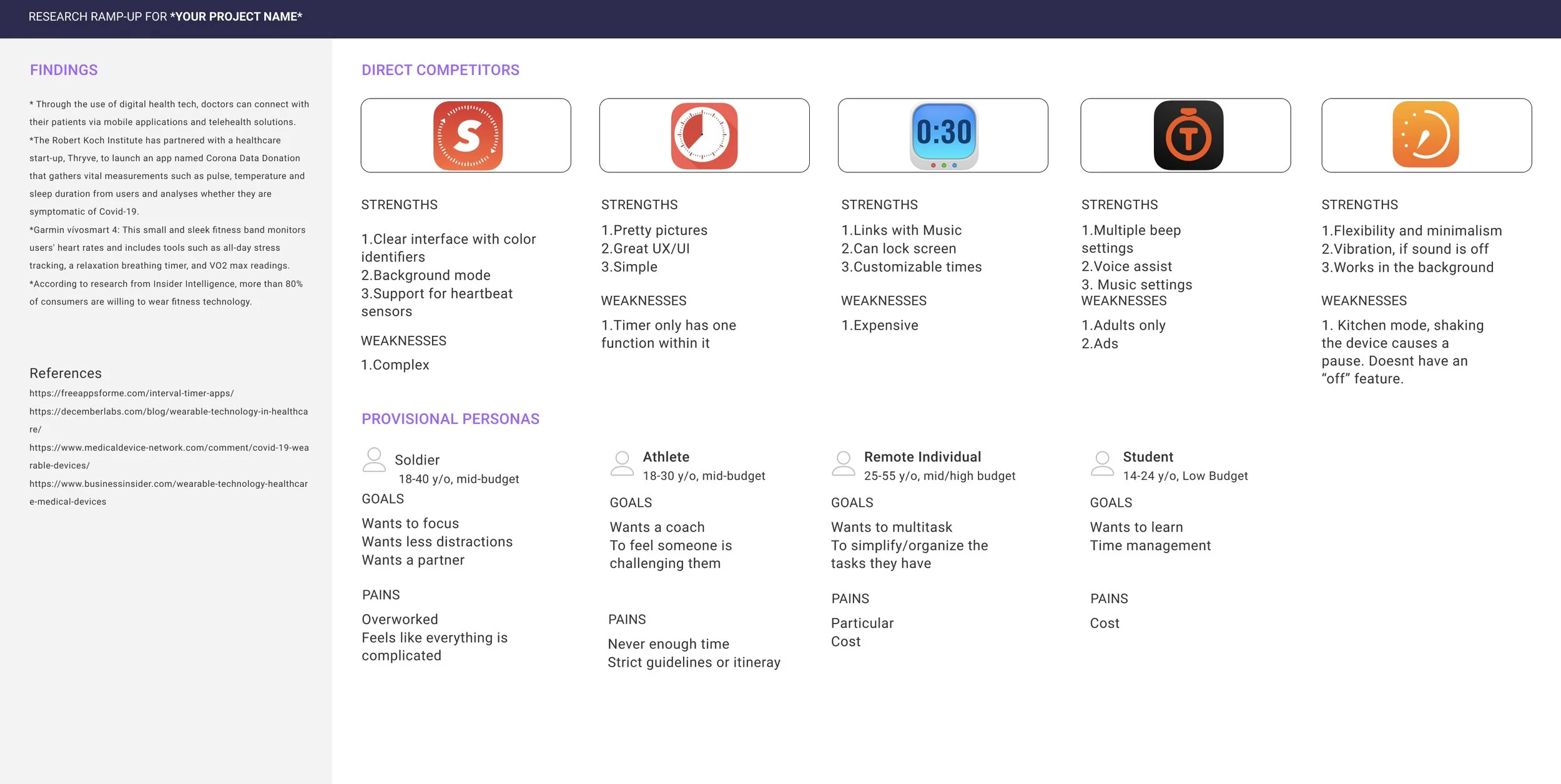
Analyze Competitors
For competitors, I focused on popular tracking apps. Apps were either very simple, or very complex. There was no in between of a simple app setup that also included many features. Interestingly, multiple apps allowed for music or sound customization on their timers. This feature influenced my prototyping work later.
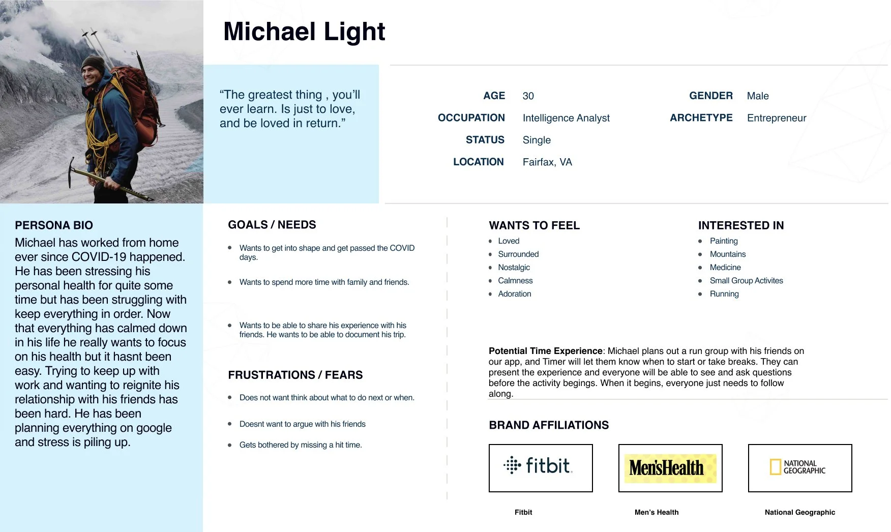
Personify the Main Potential User
Putting all the findings together, I created Michael. Michael is active, organized, and ambitious.
Ideate
From the initial research, I learned that our user will be someone who likes to plan and track, and needs to track many different types of tasks.
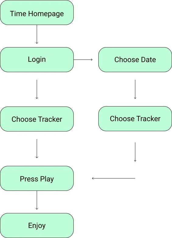
Site Map + Task Flow
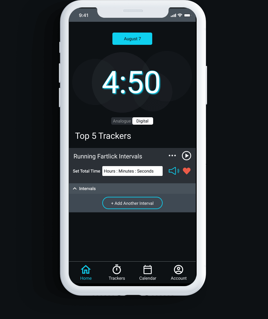
Trakr’s functionality is straightforward, so I went straight into the sitemap. I decided on how the app should be organized, and what content worked best together. Next, I created a simple task flow to figure out how a user would likely choose and use a tracker. For example, this tracker could be for 30 minutes of piano practice. They would log into their account, choose a 30 minutes tracker, and then play it to track their practice time.

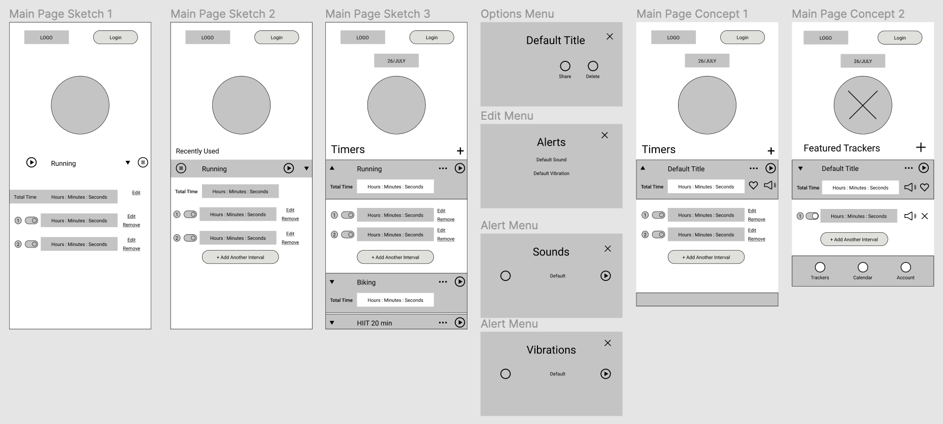
Wireframe Sketches/Concepts
I created an initial set of wireframes to ponder different ideas and concepts. I focused on the main page, since that would be the most important page on the app. These sketches were made in figma rather than by hand, but the concept is the same.
Prototype and Test
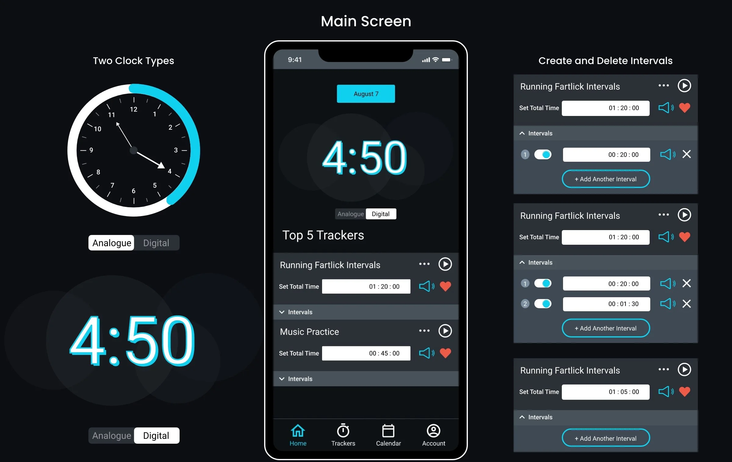
The next phase was designing in all the functionality of the app. The focus was on creating and using trackers to plan and track time. I needed these trackers to be usable for many different types of tasks, and allow for intervals within each. I also needed to allow for customization in the naming, details, sound choice, etc. Finally, all of this needed to be simple to use.
Initial Wireframed Prototype
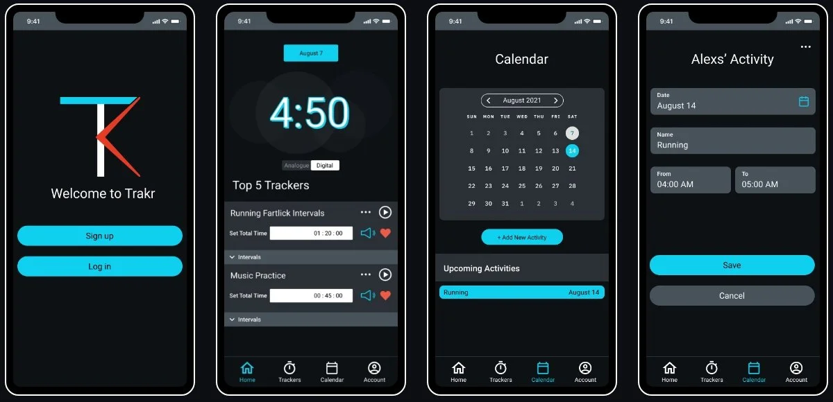
Starting from the app main page (landing page) I created a full prototyped wireframe that depicted the following main tasks:
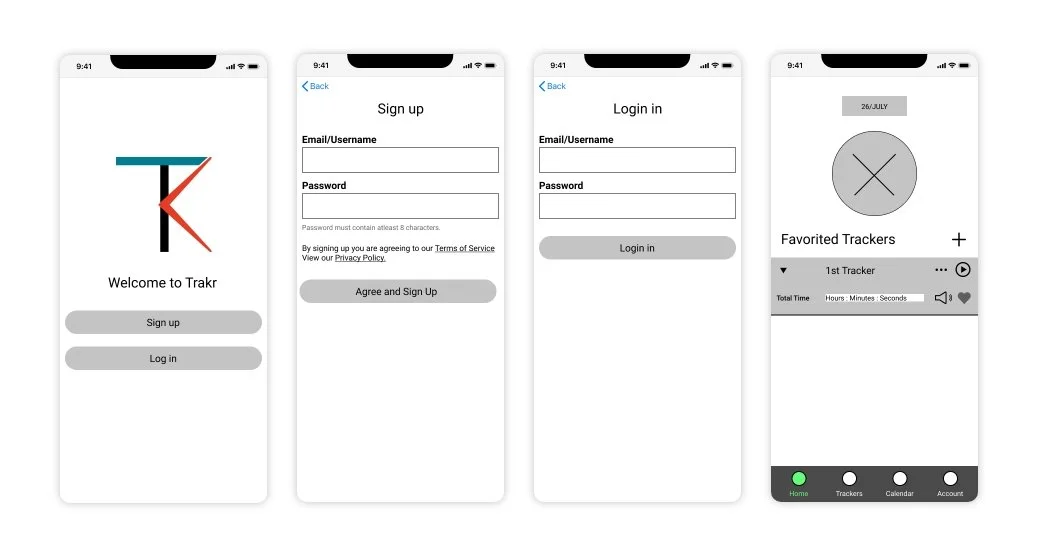
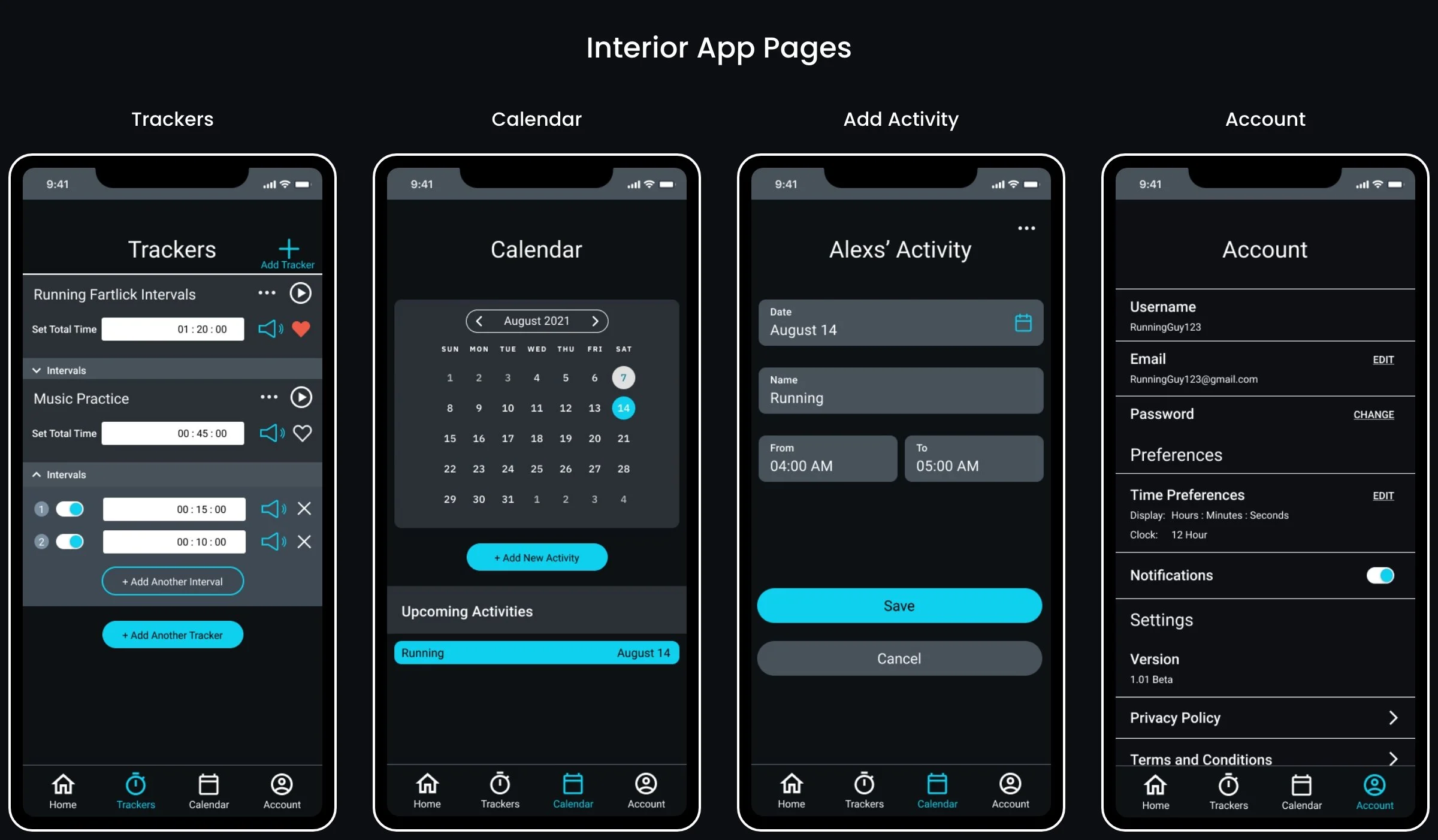
Create an account or login - the onboarding flow. I kept this as simple and the least amount of clicks possible.
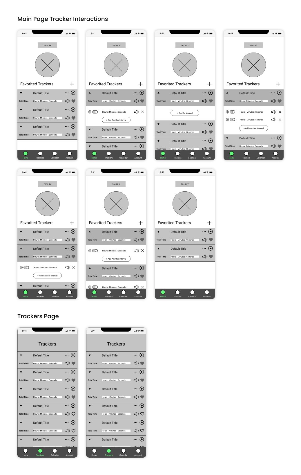
View trackers, delete trackers, favorite trackers to be featured on the main page, and play trackers.
Customize trackers by adding intervals, and also be able to name the tracker and the individual intervals within.
These functions were the main point of the app. I decided to make each tracker its own expand/collapse section so that users could complete most actions on one page. This also allowed me to use the same component on both the main page and trackers page.
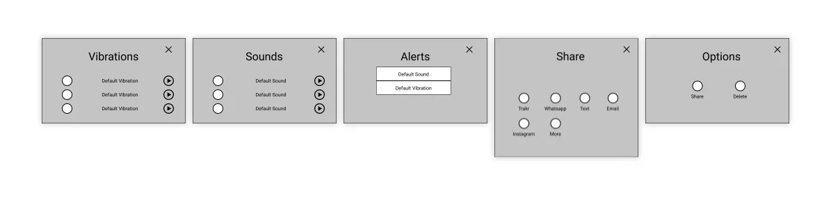
Choose a vibration and/or sound for the start of the tracker and each interval within, and share trackers with friends. This image consists of all the overlay menus created for the prototype.
Plan events by adding them to a calendar, and linking specific trackers to these events if desired.
Allow people to manage and edit their account information.
Usability Testing
I tested four different participants and took them through the various functions of the app. From these interviews, I created an affinity map to group responses and see if any repeating themes arised. The following findings came to light as seen below.
Positive Feedback
The sign up flow was easy
Participants understood most functions of the trackers through using them on the homepage. This includes adding intervals and deleting, adding a sound or vibration, and favoriting.
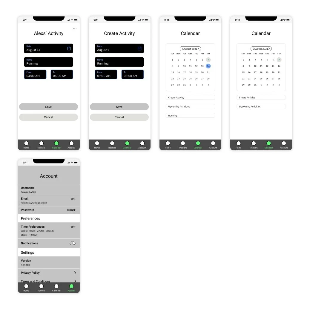
Participants really liked the calendar page, and had an easy time understanding its function. They also had no issues adding a new activity.
Pain Points
Participants got confused by a couple functions of the trackers. These were the dropdown, and that people initially thought these trackers were recordings of past events and not planned trackers for future events.
Participants became confused by the + sign to add trackers on the main page. The prototype took them to the trackers list page upon clicking the + icon. Following this, the add trackers button was missing from the trackers list page.
Participants wanted dates on the upcoming activities listed under the calendar.
From these interviews I could tell that I got the simplicity and overall flow right, but that there were some functions to tweak, especially in regards to the trackers. I took the pain points feedback and implemented changes in my final visual designs, which will be described more in the next section.
UI Design
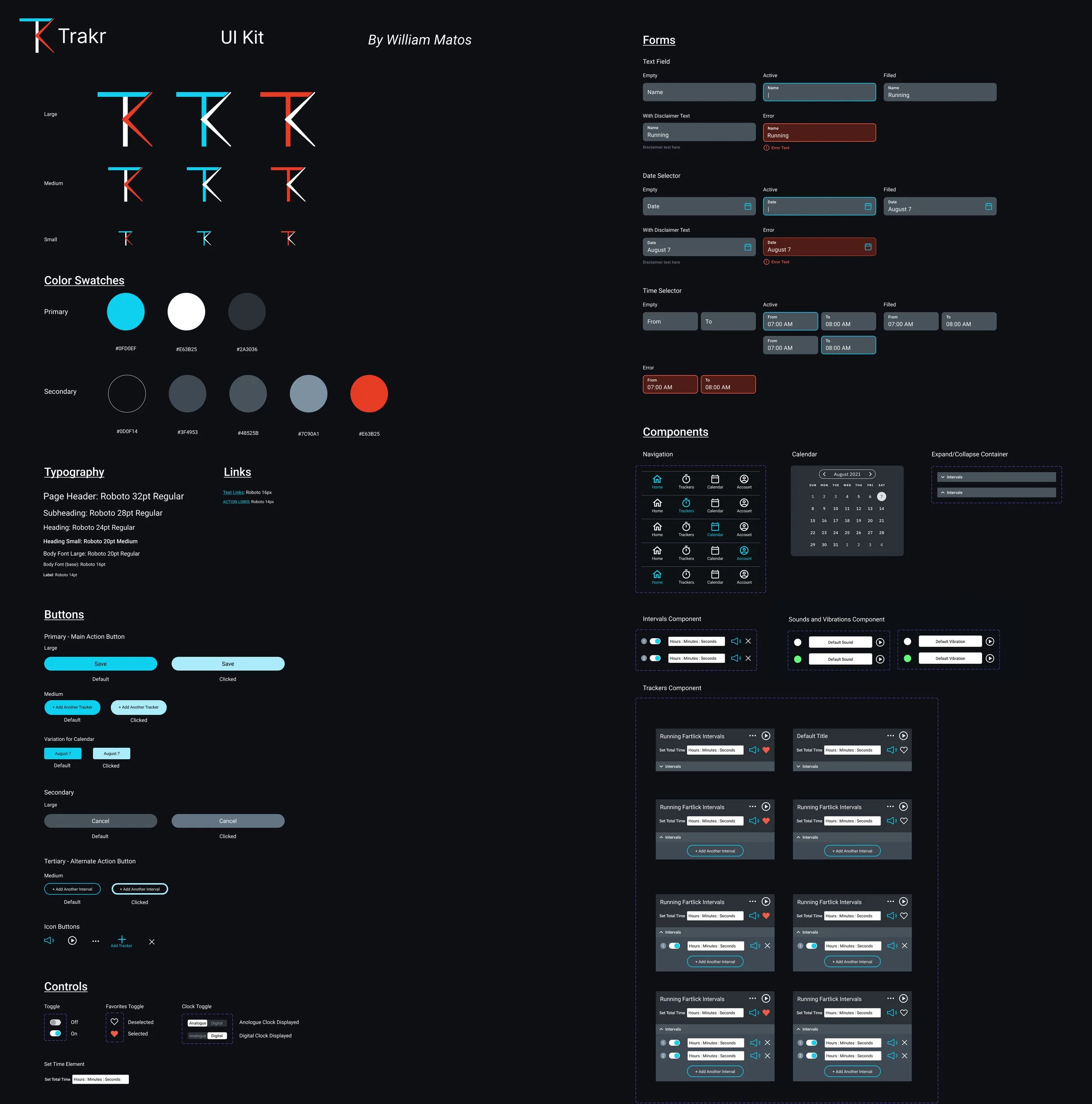
This app was a completely new concept. I created the whole UI from logo and branding, to visual mocks, to a final UI kit.
Brand Logo Creation
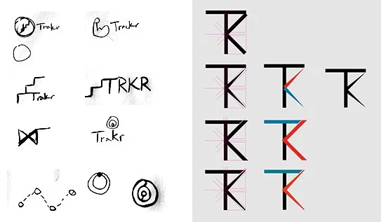
I started with the brand logo. I did crazy 8s to quickly brainstorm various concepts that represented tracker. I played with the concepts and related iconography of tracking, time, repetition, planning, etc. From here, I decided to dig deeper into the concept of time, playing with the T and K in the logo, and the hands of a clock.
Final Logo
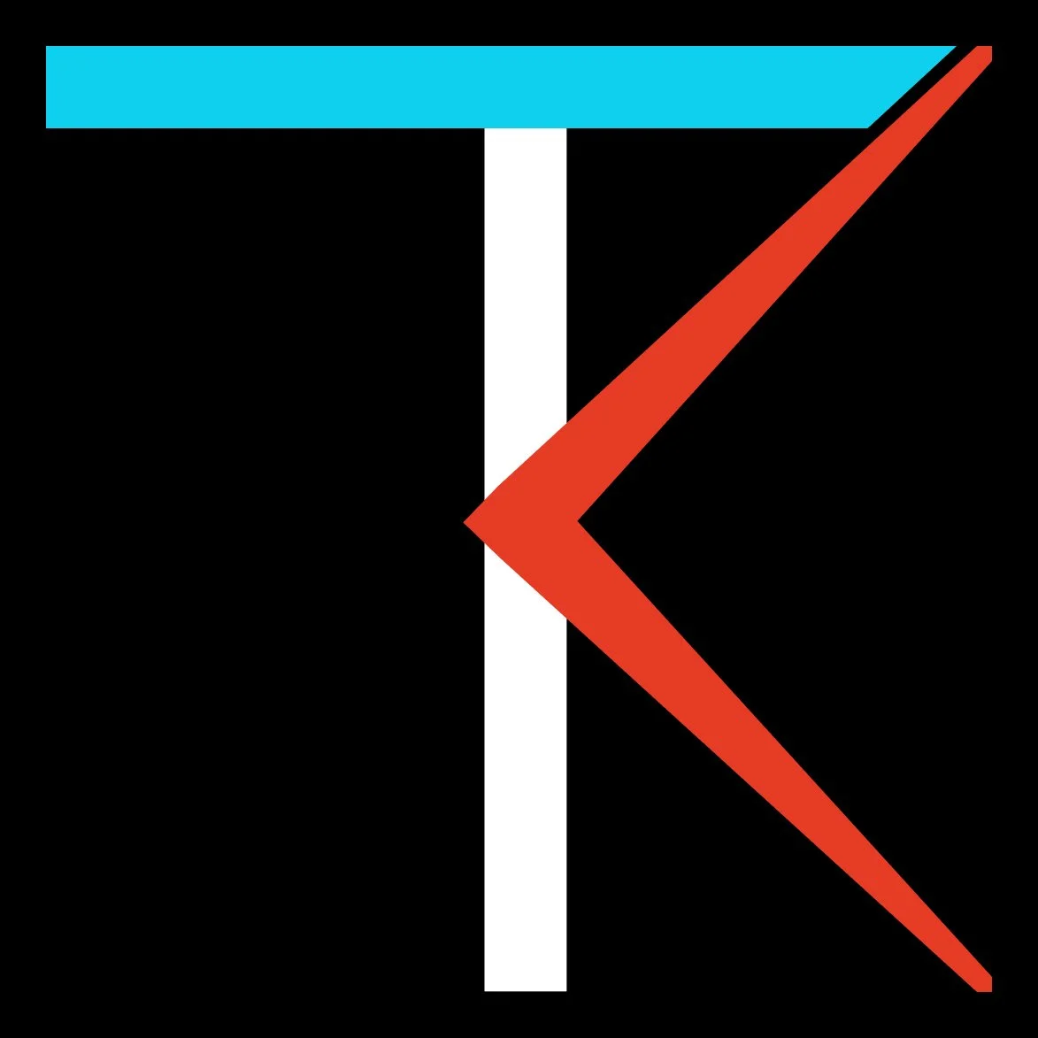
I refined the spacing and placement of elements from this concept into a final Trakr logo. I paid attention to visual balance and alignment of all elements. Originally, the logo was designed on white, but later changed to this due to the app being dark. On a light background the white middle bar would become black.
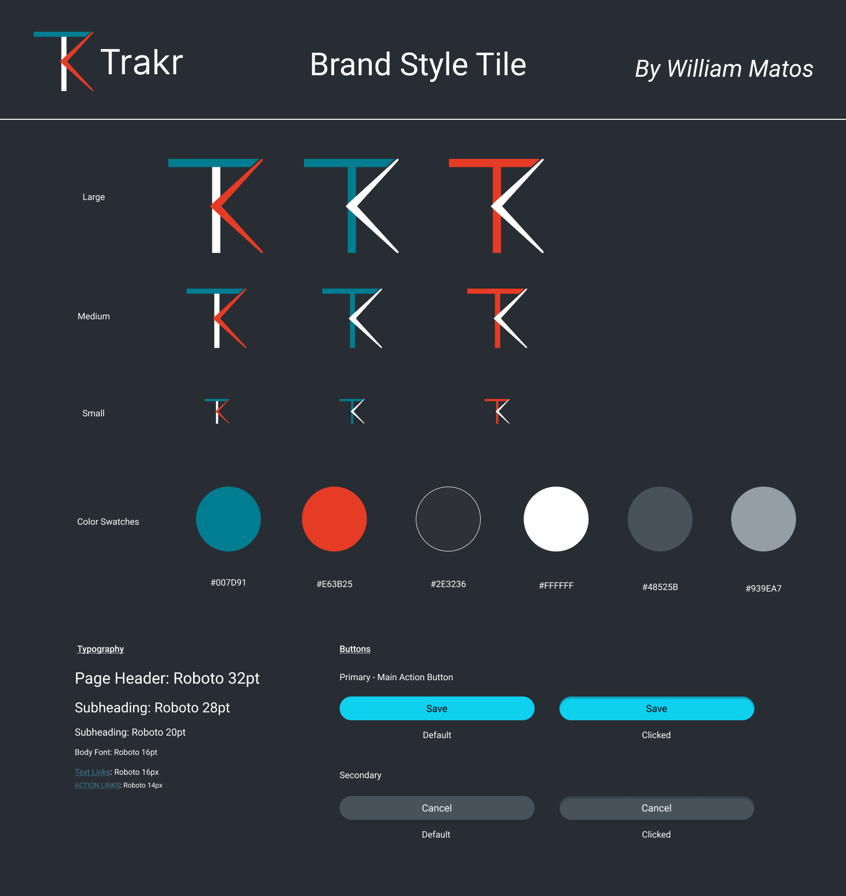
Brand Style Tile
I created an initial brand style tile to experiment with colors, typography, and any other visual concepts needed for the UI.
At this time, I also decided I wanted Trakr to have a dark background, this gray being the first version.
UI Design
Over the course of converting the wireframes into UI designs, I noticed the initial gray background didn’t provide enough contrast. From here, I went back and tweaked all my colors, especially for text and buttons, to make sure they were all ADA compliant to a WCAG AA standard. I ended up with a darker theme and better contrast.
During this phase I also implemented edits from the usability testing pain points.
Participants got confused by a couple functions of the trackers. These were the dropdown, and that people initially thought these trackers were recordings of past events and not planned trackers for future events.
Participants became confused by the + sign to add trackers on the main page. The prototype took them to the trackers list page upon clicking the + icon. Following this, the add trackers button was missing from the trackers list page.
Participants wanted dates on the upcoming activities listed under the calendar.
View the UI Prototype
UI Kit
I compiled a UI kit of all design system parts and components while working on the UI. This kept everything current and organized. Every variation of type, color, or component is in this kit. My UI kit is the start of a design system for Trakr.
Next Steps for Trakr
I want to turn Trakr into an actual app on iOS and Android. To do that, I’ll need to retest again with more participants to verify or further tweak the UX. I also want to add an onboarding flow for people using the app for the first time. I believe it will reduce user error and confusion. From there, I’ll start working with a developer to get this app created.