
Helping a Small Sustainable Fashion Brand.*
Daydream Skies is a small fashion brand, making one of a kind apparel and accessories that focuses on sustainability.
Currently, daydream skies only has an etsy shop. The owner asked if I could design her a website for her. Her goal was to have a website that appealed better to her user base and also more clearly share her brand’s uniqueness and values.
The website design is now completed, approved and is in production.
*The client has given me full permission to share my work.
How Do People Shop Online for Clothing?
In order to create a better shopping experience for Daydream Skies, I had to better understand what works and doesn’t work for shopping online. What types of features do people appreciate most? What turns people off? How does one brand stand out over another?
I conducted a series of discovery interviews to understand how people shop online and what makes their favorite clothing brands stand out?
I focused my interviews on people’s experiences online shopping and their preferences. We discussed what they usually shop for and what’s that like. We also discussed their best and worst shopping experiences, and contrasted the two. I really wanted to dig deep into interviewees feelings, as shopping for clothing is often and emotional and about self-expression.
Key Takeaways
People Come with Their Own Style Preferences
Each interviewee had their own styles, and chose brands initially because they found that brand’s clothing style appealing. People will only consider buying from a brand if they first like what they see. The best solution for a brand is to highlight and share the styles they have.
Personal Touches Matter
Personal notes, thank yous, or other appreciation from an owner goes far. For interviewees who had purchased from small brands, they said these personal touches are what made them keep coming back.
Personalization is Big
All interviewees expressed that their favorite online sites were personalized to them in some way, and knew their styles well. This includes features such as recommending products they’ll like based on their past purchases or current items in their cart, having a brand personal stylist they can chat to, or robust filtering options such as fabric, size, color, or style.
Also, all interviewees mentioned that they liked instagram ads because instagram was very good at recommending clothing that matched their style. When personalization is done well, its memorable.
Make the Whole Experience Easy
Online shopping can be a pain because people can’t experience the product. Interviewees expressed that they wanted sites to make it easy for them through the whole experience. This includes an easy checkout and good return policy. Multiple interviewees discussed a difficult return process ruining a whole shopping experience for them, and discouraging them from shopping on that site again.

Regarding Sustainability
I also asked questions about sustainability at the end of each interview since that’s a core value of Daydream Skies, and that subject was specifically requested by the owner. Each interviewee had a different concept or understanding of sustainability. The concept itself is very broad and can also be termed eco-friendly. Different interviewees had different preferences of which words should be used. However, there were still a few key findings here too:
People will only buy a sustainable clothing product if its already a style they like. They’ll happily choose a sustainable product or product version if it matches their style preferences. However, if they don’t like the style to begin with, being sustainable won’t motivate them to purchase.
Sustainable products can be more expensive. Interviewees mentioned that they would pay a few dollars more for a sustainable product.
Be clear in how it’s sustainable or eco-friendly. Sustainability, eco-friendly, and other environmentally positive sounding phrases have become marketing catch phrases. A couple interviewees mentioned they had purchased sustainable products. When explaining their decision, they all mentioned how those products clearly explained how they were sustainable or eco-friendly.
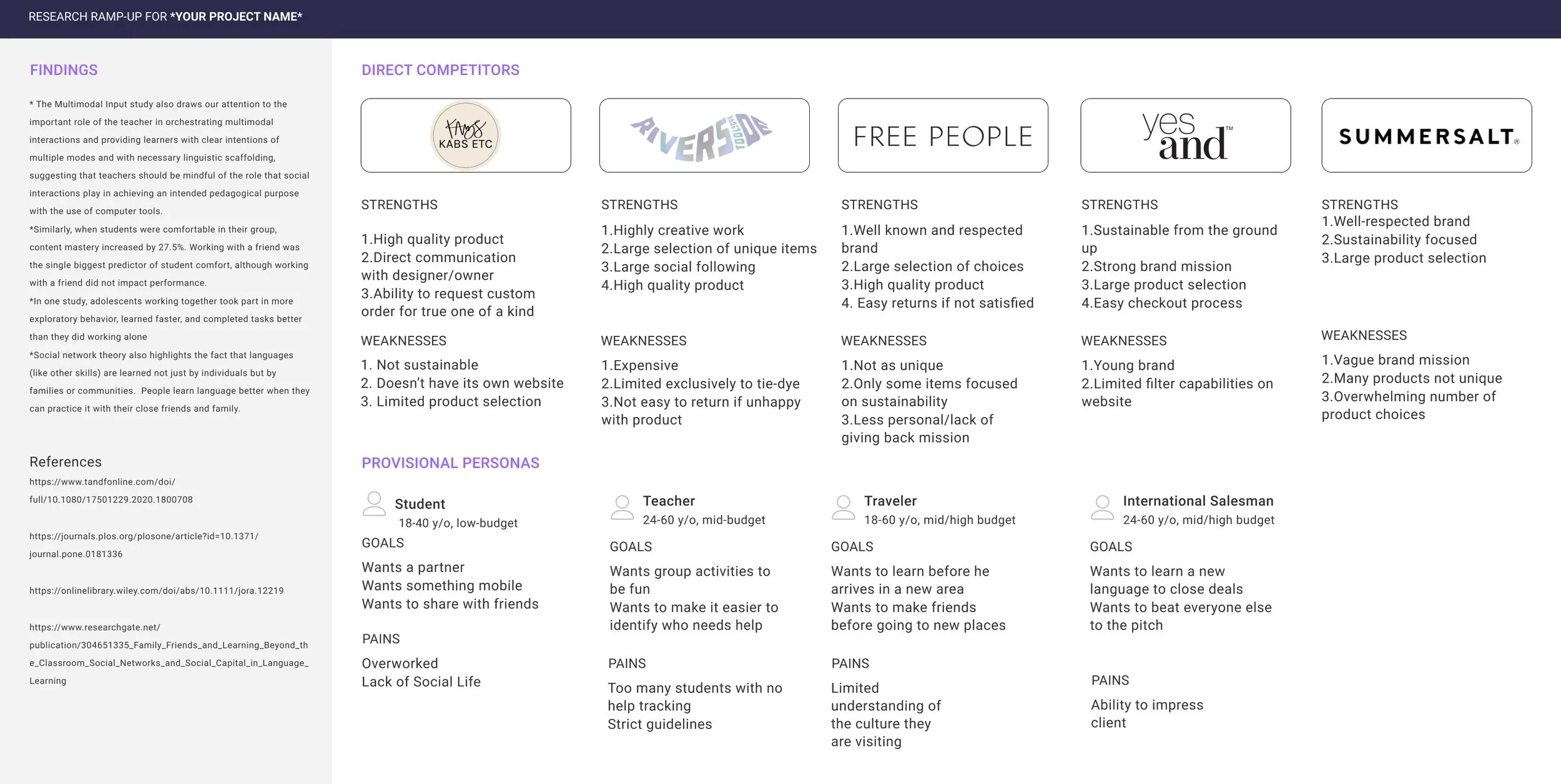
Analyze Competitors
I analyzed competitors that reflected various aspects of Daydream Skies - small size, sustainable, similar products, attracts a similar user base. I also included provisional personas of Daydream Skies likely typical customers.
I did notice that each of these brands made one item their focus - either unique products, curated style, or sustainability. Also, one of a kind or custom designs tended to be more expensive, which is something for Daydream Skies to keep in mind.
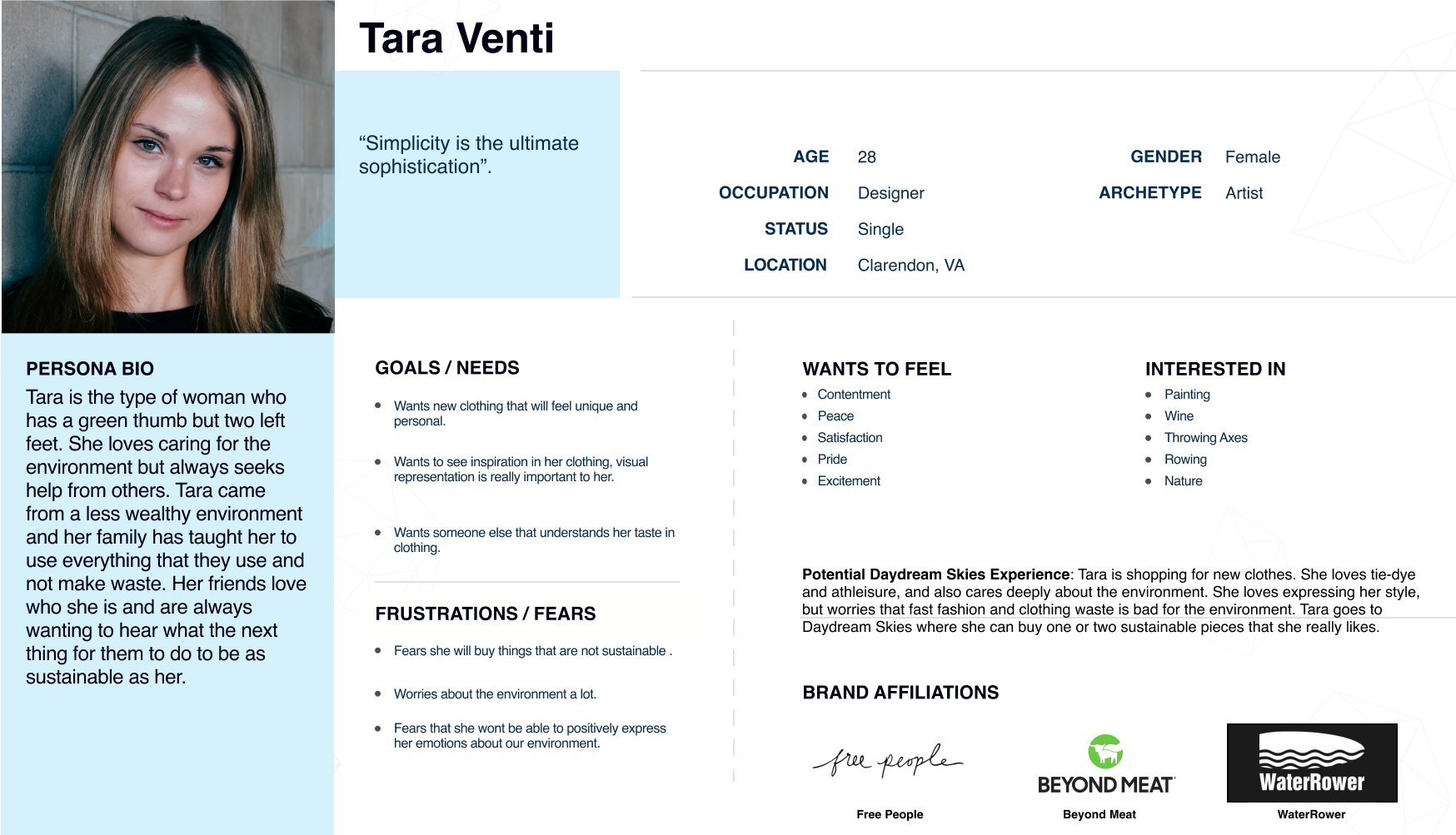
Creating Our Main User
From the previous two research tasks, I identified our likely user, Tara Venti. She’s someone whose fashion style matches Daydream Skies, and also deeply cares about the environment. She’s creative, expressive, and deeply empathetic.
This persona is built on a key piece of info from interviews: Users already have a set style, and will only buy from brands that carry those styles. Daydream Skies main users will be people who like tie-dye, one a kind clothing, athleisure, and cute casual. Even with the best pictures and quality site, Daydream Skies clothing will not appeal to everyone.
Structuring the Site
The next step was figuring out how to best structure and organize the site. Daydream Skies has various products that needed to be organized into a site navigation. I needed to work out a typical flow for a user buying a product. Last, I wanted to dig deeper into the emotional experience as a user journey’s through the site.
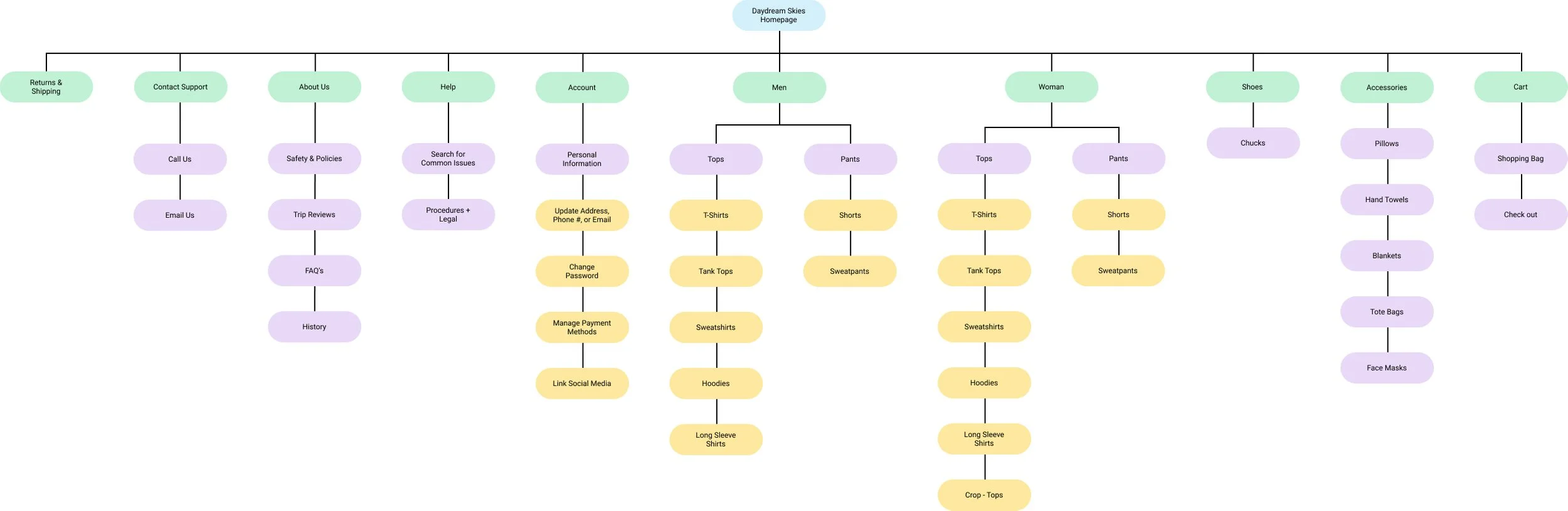
Card Sorting and Site Map
A card sort was essential here. Daydream Skies has many different products including various clothing and accessories for men and women. They also have a brand mission, and need to include items such as help, and return and shipping policies. I wanted to ensure that the site was organized in the way that made the most sense to users. There was some variation in organization, but large categories generally were clothing, accessories, and the brand and policy sections. Non-clothing products had the most variation in grouping, so that’s something to retest in the future on the site.
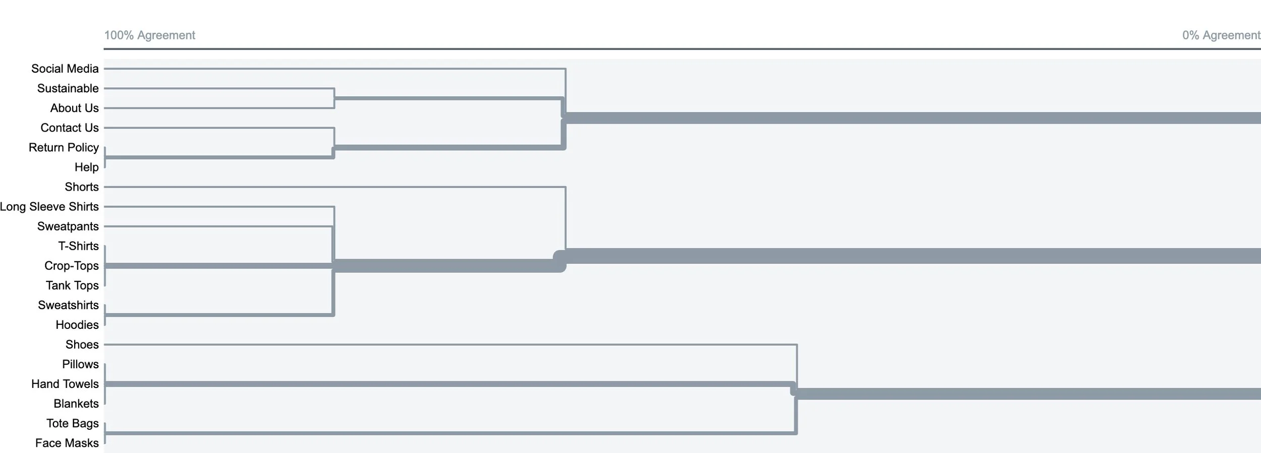
For the sitemap itself, I broke clothing into mens and womens, which weren’t specified in the card sort since they have a lot of overlap in clothing items.
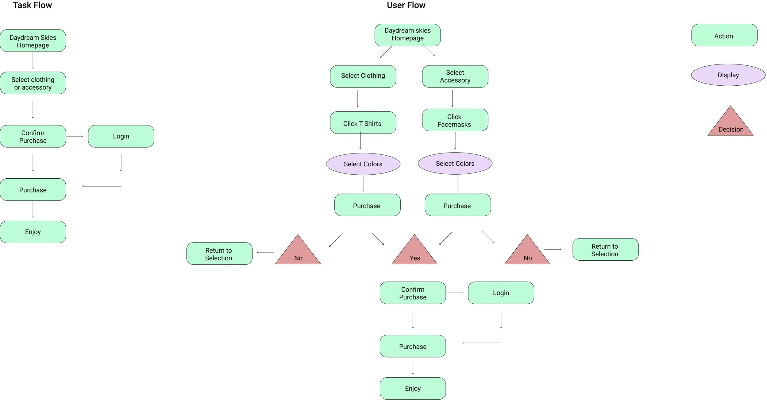
Taskflow + User Flow
Next, I needed to visualize how a user may flow through the site to buy am item. I created both tasks and user flows to help me visualize this whole process. The task flow was focused on the happy path of purchasing an item. The user flow expanded upon this, adding the decision aspect as well.
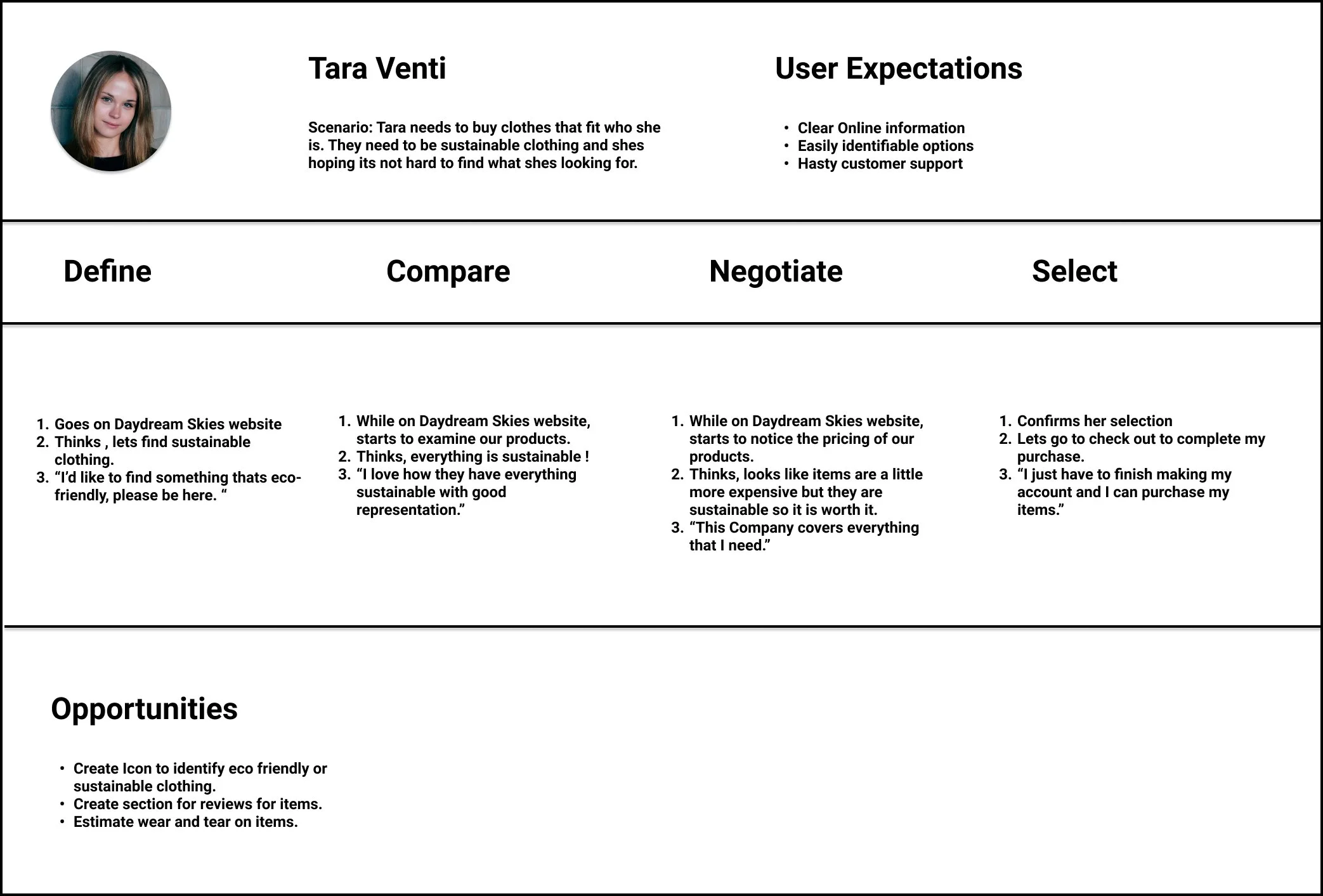
Journey Map
I choose to explore deeper into the thoughts and feelings behind each step of purchasing a product from Daydream Skies. To do this, I created a journey map from the persona, Tara Venti. This allowed me to empathize more deeply with Daydream Skie’s potential customers.
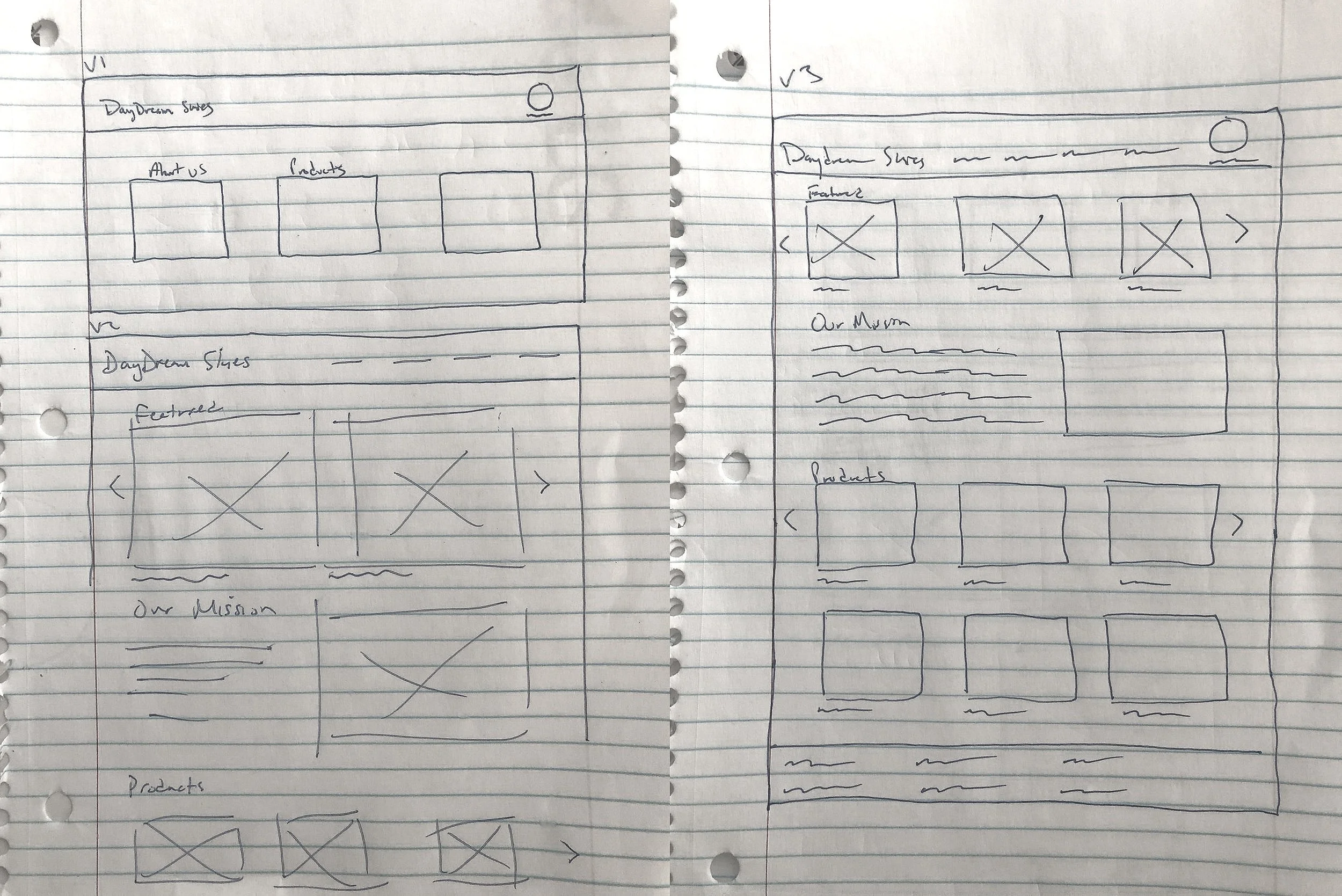
Page Sketches
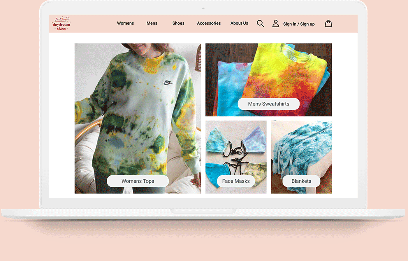
I started putting my ideas to paper, creating two page sketches for the homepage. I focused on keeping it simple, making it easy for users to browse many products, and making products visuals large. I also included the mission, since that aspect sets Daydream Skies apart.
Prototype and Test
From the initial research, I learned that our user wants personalization, large and appealing images, an easy shopping experience throughout, and appreciates a personal touch. I created my page wireframes with a focus on all these key findings.
Initial Wireframes
Homepage and Browsing
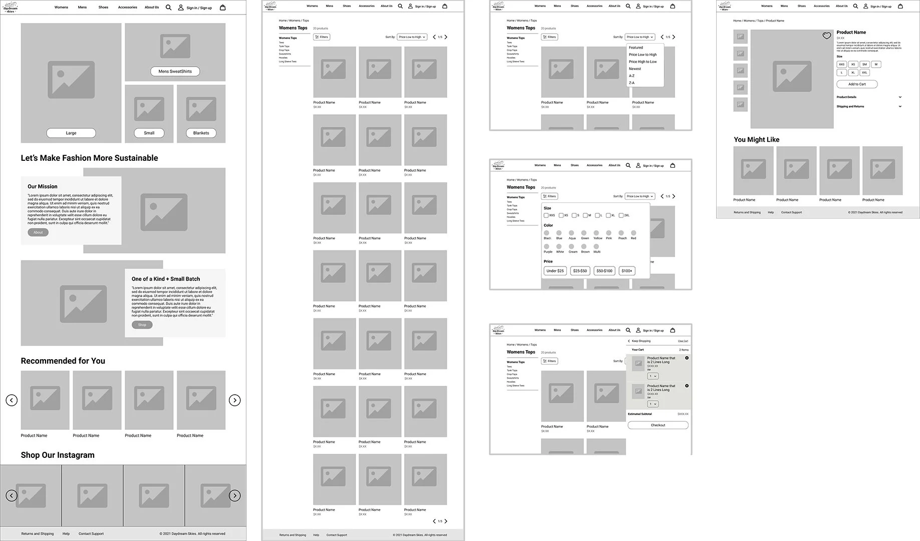
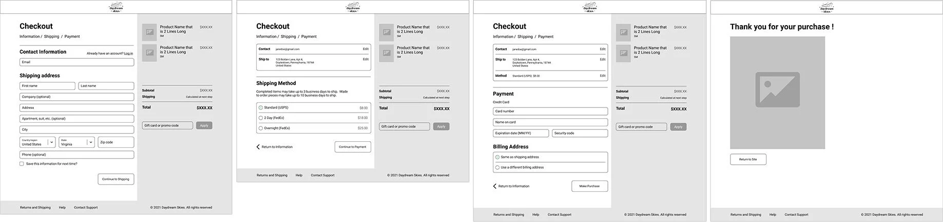
Checkout Process
Usability Testing
I wanted to test the following questions and prompts:
What does a user think when they land on the homepage?
Is the user able to click and select a product category?
In a product category is the user able to click on a product? Does the page have enough context?
Does the product category page cover any customization or filtering down that person might need? Are the sort by and filters easy to use and understand?
On the product selection page, is a user able to select size and add to cart? How do they feel about the cart popping up on this page on the right, instead of being a separate page?
Is the user able to checkout from the cart?
Is the checkout process easy to complete and fully informative?
Overall, is there anything missing that the user would like to see added? Is there any feature that’s unnecessary and should be removed?
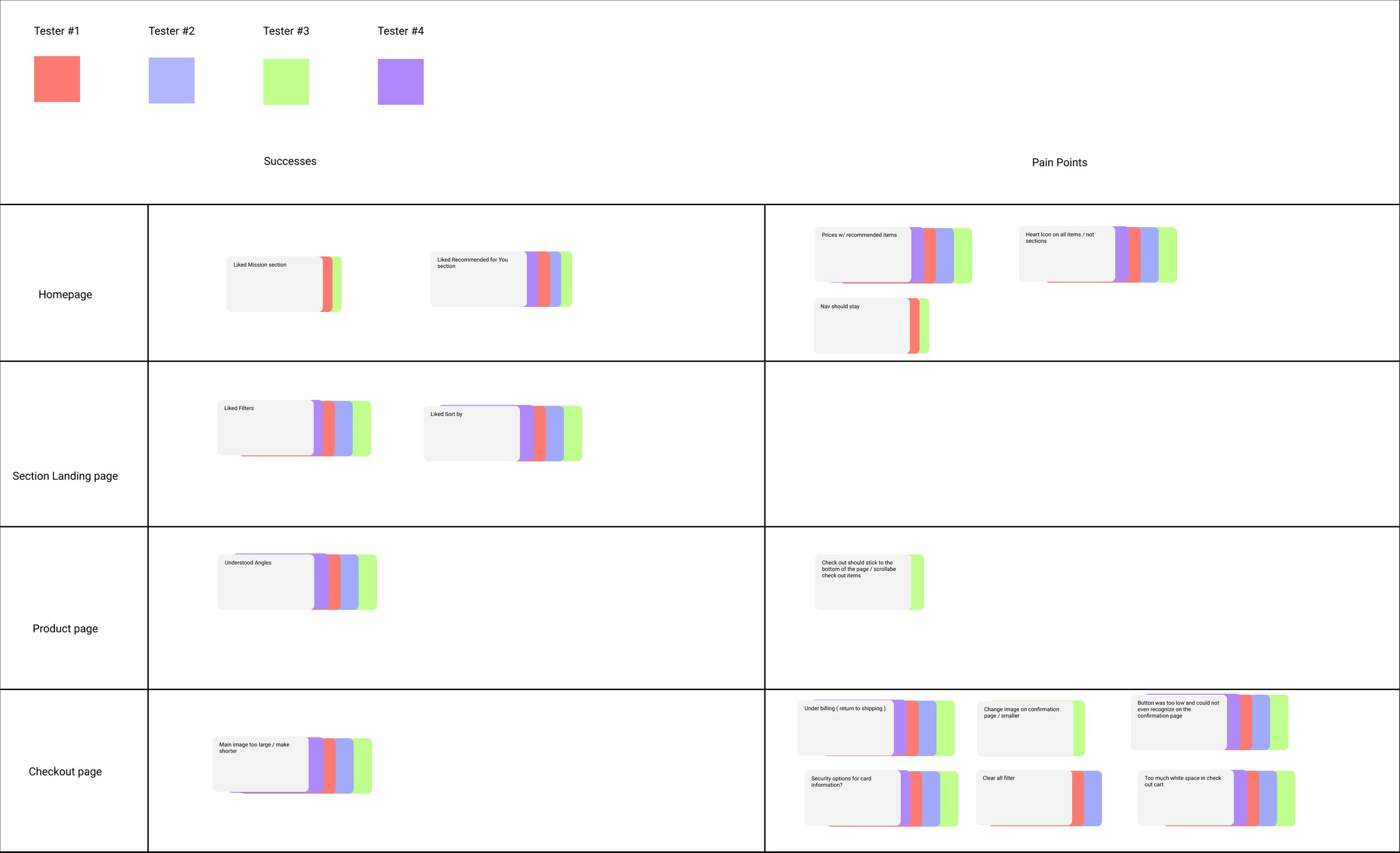
Planned Final Revisions
I user tested with four participants. From my testing notes, I created an affinity map of common themes. For pain points, a few items came up:
Add heart icons to all product images so they can be favorited on any page.
The nav should stay sticky at the top of every page.
On the section landing page, the filter needs a “clear all” function added.
The “You Might Like” items (recommended items) on the product item page should have prices listed underneath.
The cart overlay should be the height of the viewport, with the checkout button sticking to the bottom. Items within the cart should be scrollable.
In checkout a few key pieces of information was off. There link needed to say “return to shipping” under the billing page, and a security code field needed to be added for credit cards.
On the confirmation of purchase page the image was too large and the button back to the website too low.
UI Design
Next, I went into UI design. I started with brand and identity. From there, I improved UI design and converted the wireframes w/ feedback from testing to final visual mocks. Throughout each step, I shared my work with the client and received feedback. With some back and fourth, we agreed on everything below.
Brand Style Tile
The client already had a brand logo for Daydream Skies that she really liked and wanted to keep. She also asked that I also use her logo color as one of the main colors for the site. I analyzed the style of her logo, the color, and the typeface, and built out a style tile from that initial context.
I made her brand logo a bit darker for ADA compliance, and asked her if this was okay. She was fine with it since it looked very close to her original color. She also loved all the other colors, the buttons, and the layout example
The only qualm she had was the typography. I originally chose Clementine for headings, and she said it looked too script and playful. She wanted something more refined, but with the elements of the type in her logo. From this feedback, we chose Catamaran for headings.
Original Style Tile
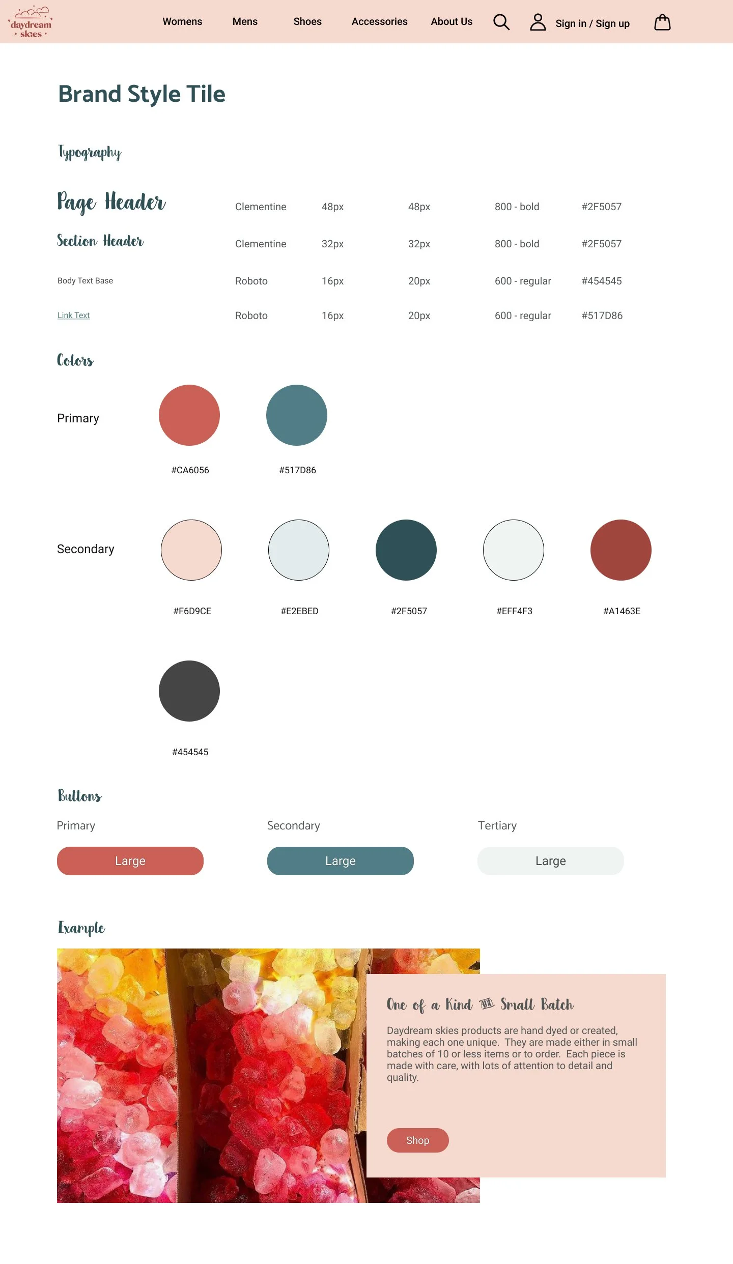
Revised Style Tile with Updated Typography

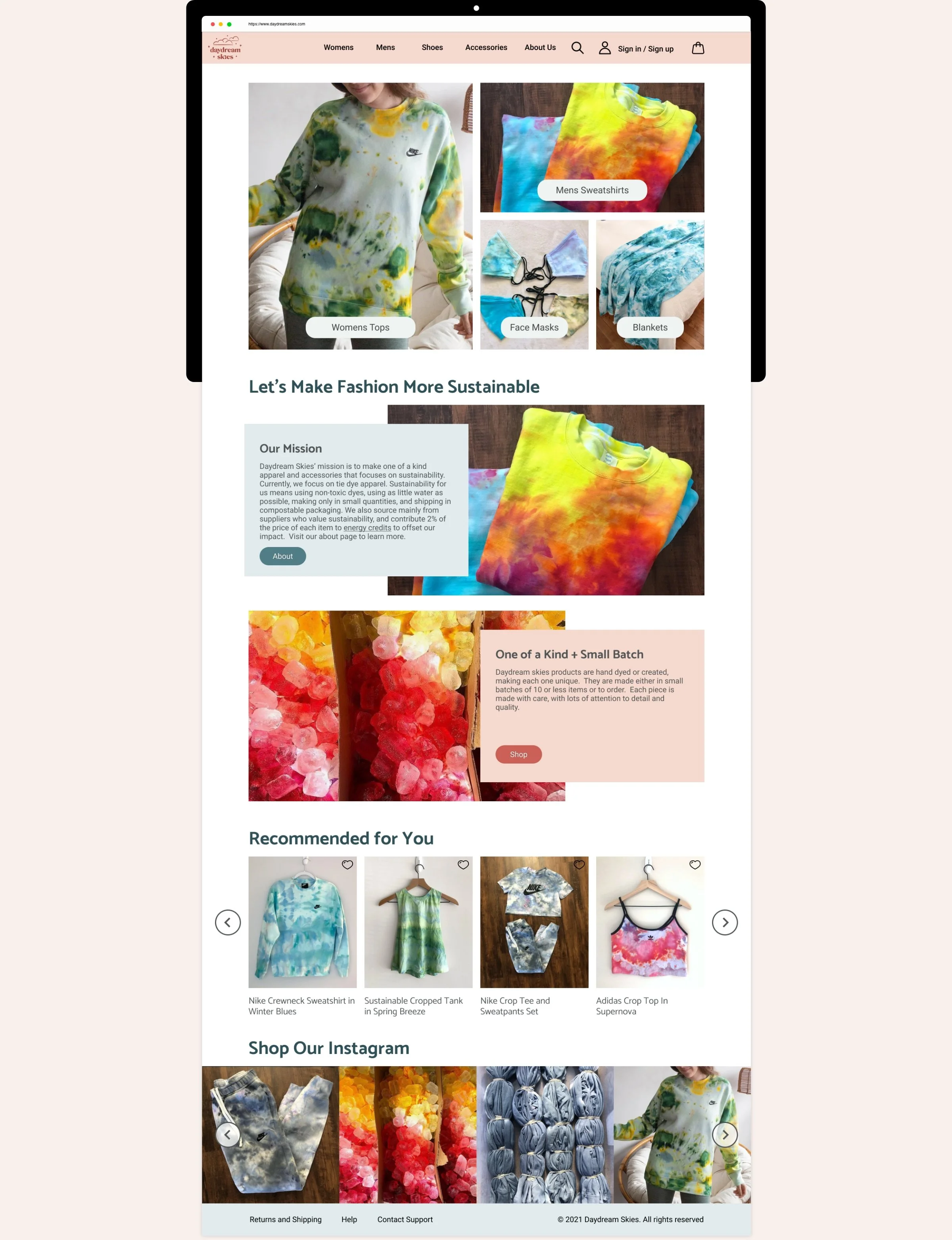
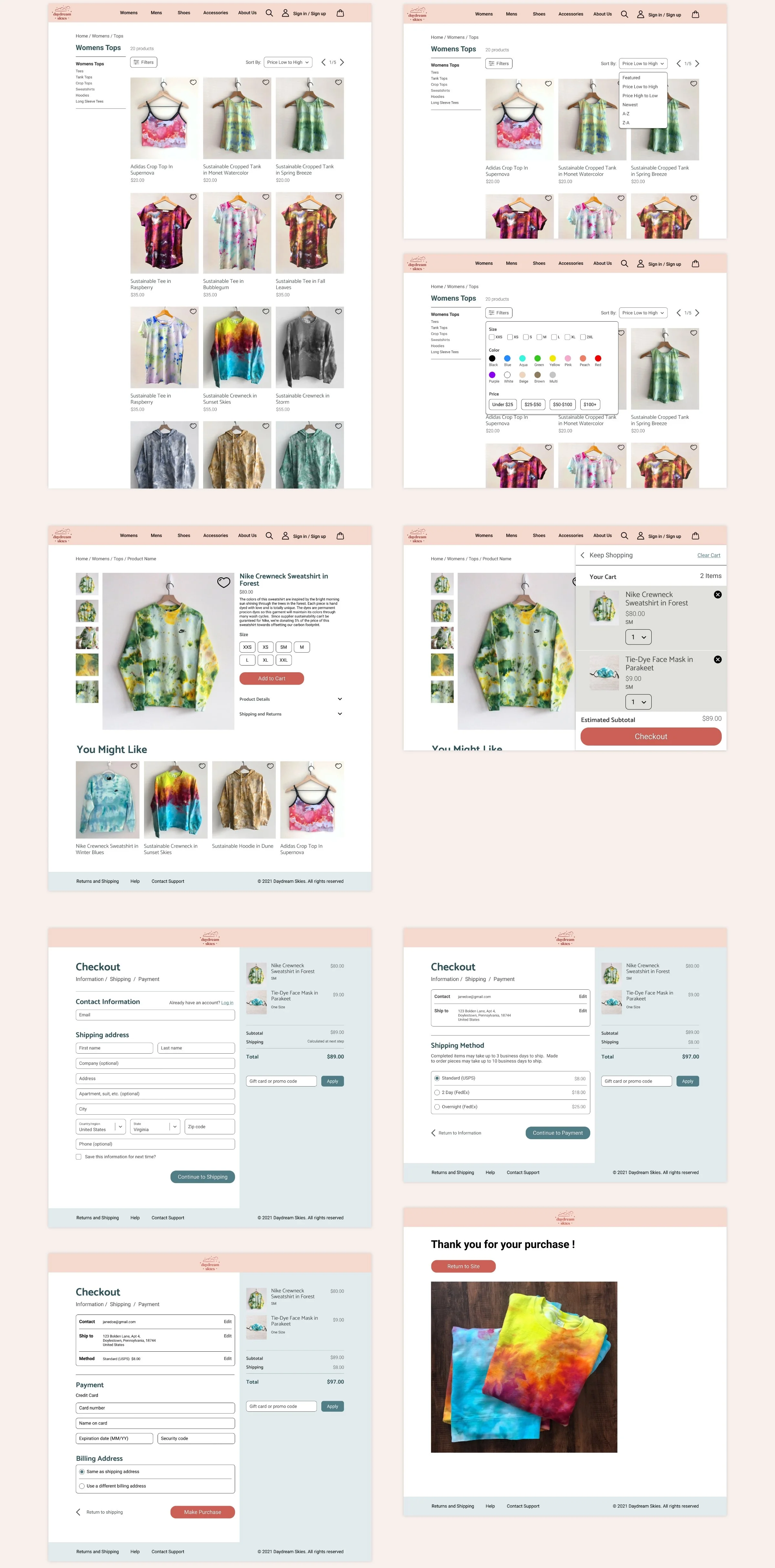
UI Page Design
With the brand styles approved, I built out the pages of the site. I started by addressing all the pain points listed above in planned final revisions, and then added all the styling. I created the UI design as a prototype so the client could visualize how everything worked. Also, it could be tested again later.
Sustainability
The client requested I make the sustainability aspect prominent. From the earlier research, I shared that she needs to clearly share how she’s sustainable, with concrete details. To achieve this, we chose to make it a prominent section on the homepage, and expand upon the details in the subsections “Our Mission” and “One of a Kind + Small Batch.”
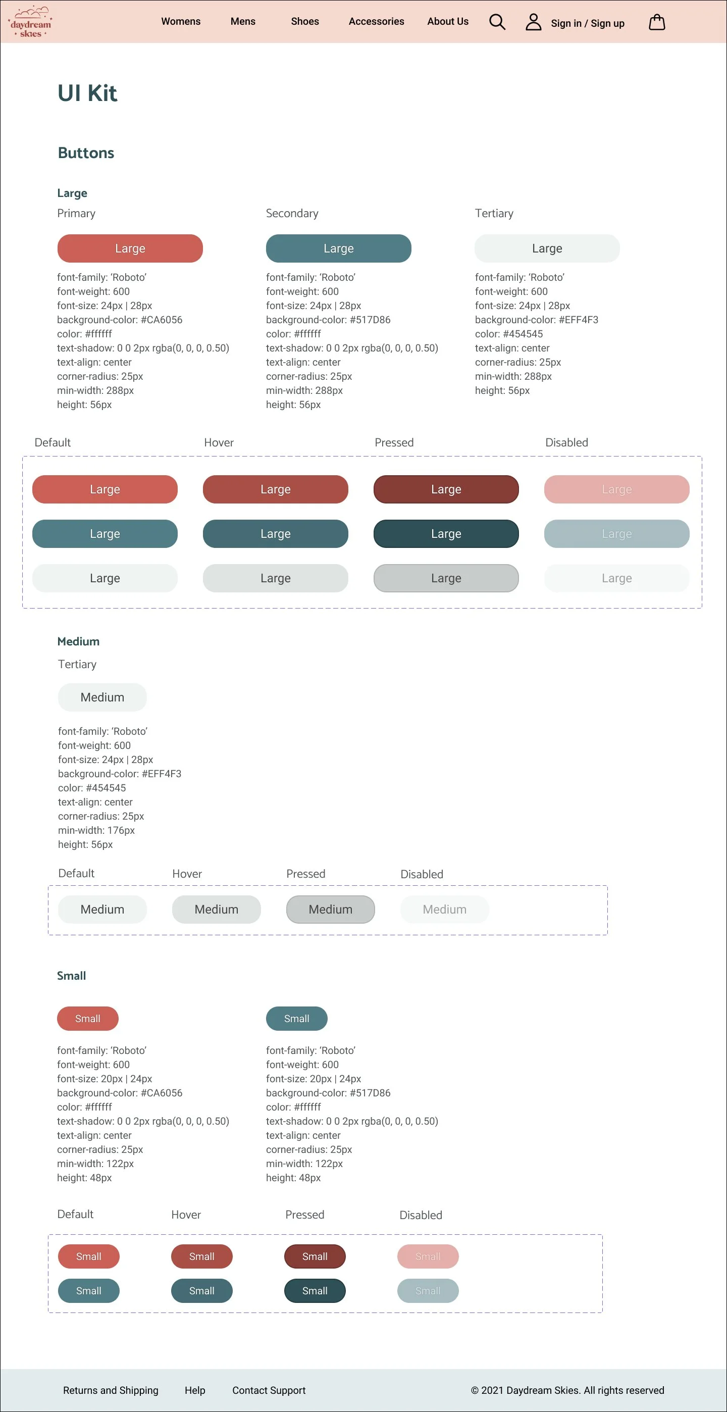
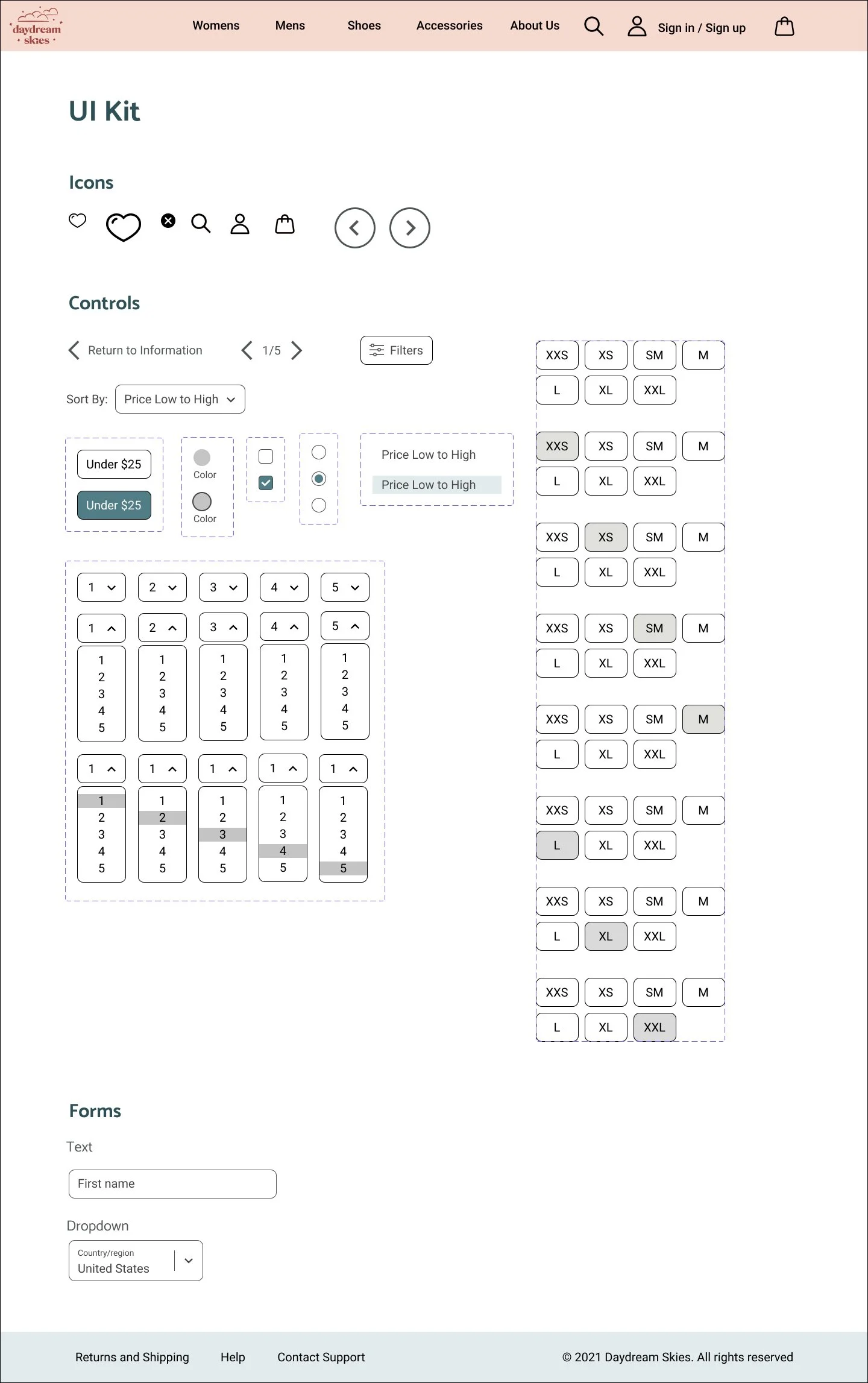
UI Kit
I created a UI kit while working on the page designs. I tracked all the typography styles, button styles and sizes, and components I used. At the end, I refined the information in the UI kit into a full design system that could be handed off to development. I handed it off to the client as a final deliverable, and explained that this was her site’s visual guide. I also told her to share this document with whoever develops her site.

What’s Next?
Daydream Skies is currently in development. The client and I agreed that I’ll do another round of user testing for her with the live site. This way, we can validate if the edits worked, and if any further changes are needed in the near future.